Why Did My Forecasting Model Get Worse After Adding More Data?
This morning, I added five new days of solar production and weather data to my forecasting model. The weather had been glorious: clear skies, strong sun, barely a cloud in sight — the kind of days solar enthusiasts dream of. Our system produced around 55 kWh daily, close to its practical limit. Naturally, I expected my model to be delighted with these new inputs — I mean, who doesn’t like sunshine?
But no.
Instead of improved performance, I got this:
| Model | R² Score | MAE (kWh) | |-------------------|----------|-----------| | Before Update | 0.8769 | 3.89 | | After Adding Data | 0.8607 | 4.44 |
Lower R². Higher error.
Had my model developed a vitamin D allergy? So I dove into the data to find out what was going on — and uncovered a few enlightening insights.
What Changed?
The five new days had: - Excellent solar production (~55 kWh) — among the highest ever recorded on our system. - Great weather — GTI near peak, low wind, reasonable temperature.
These were, by all accounts, textbook-perfect days: high irradiance, stable temperature, zero cloud cover, and production figures approaching the system’s theoretical peak. The kind of conditions that make you want to print a screenshot, frame it, and hang it next to your inverter. Yet the model responded with … pessimism. Instead of celebrating the sunshine, it hedged its bets, predicting outputs 10–15 kWh below reality — as if it couldn’t quite believe the weather forecast. I imagine it muttering, “Surely this is a trap. Probably just partial sun with unexpected fog. I’ll go with 42.”
Why Did Accuracy Drop?
1. Distribution Shift: My Model Didn’t Expect Summer in April
My historical dataset is—how shall I put it—very Belgian. Think damp, grey, and solidly mediocre when it comes to solar output. Out of 1,378 total days, only 175 days (≈12.7%) had production above 50 kWh. That means nearly 87% of the time, the model saw modest, respectable-but-not-exciting energy yields. In other words, it was trained to expect drizzle with occasional optimism.
So when five blazing days rolled in—sun high, GTI off the charts, panels humming—the model panicked a little. It blinked, looked around nervously, and said: “Eh … probably 42?” This isn’t a flaw in the algorithm; it’s a reflection of its upbringing. Like someone who’s only ever driven city cars being handed the keys to a Tesla Model S Plaid. “Are you sure I’m supposed to go this fast?”
The histogram below shows just how rarely the model encountered high-yield scenarios:
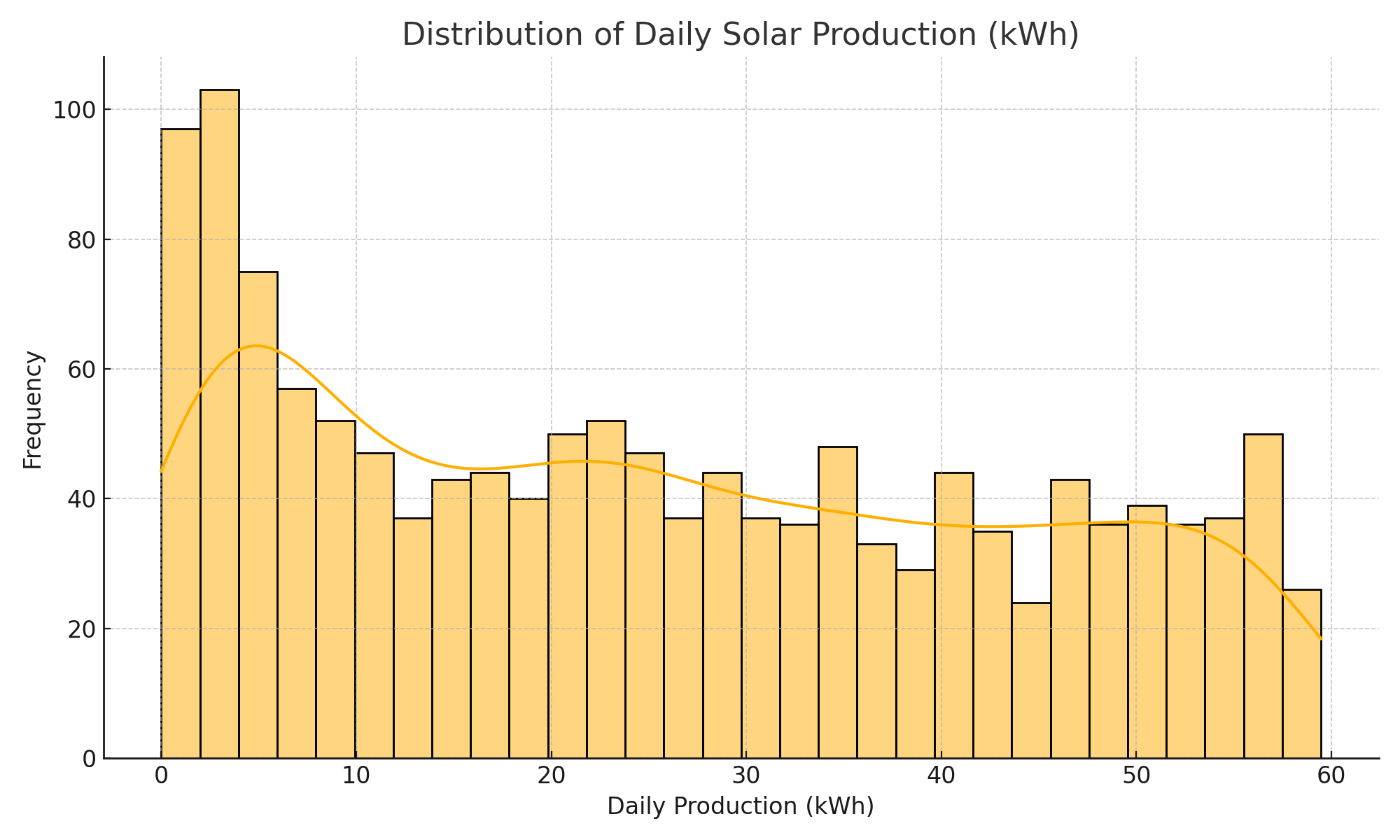
Figure: Distribution of Daily Solar Production (kWh). Only ~12.7% of days exceeded 50 kWh. Models don’t like surprises.
2. Subtle Features, Big Consequences
Even though the weather was excellent, GTI and temperature values weren’t dramatically different from what the model had already seen. GTI tends to saturate, and temperature ... well, doesn’t always correlate linearly. So the model didn’t “see” enough signal to justify going all the way to 55 kWh. It wasn’t a lack of sunshine — just a lack of convincing numerical variation.
3. Overfitting to the Middle
Let’s be honest: machine learning models are creatures of habit. If 80–90% of your historical data falls in the 15–45 kWh range, your model will become very confident that this is the “normal” zone. It will happily predict 32.6 or 41.2 all day long.
But throw in a few rare outliers — a 55.4 here, a 57.1 there — and it gets twitchy. Not enough evidence. Not worth the risk.
This behavior is a classic case of overfitting to the center of mass. It doesn’t mean the model is bad — just overly cautious, like a weather app that always predicts “partly cloudy with a chance of disappointment.” It’s the machine learning equivalent of a dog that’s only ever seen squirrels suddenly spotting a kangaroo. It freezes. It stares. It guesses squirrel again — but you both know that’s not a squirrel.
Visualizing the Issue
If you plot actual vs. predicted values, you’d probably see a neat, confident cluster stretching across the 15 to 45 kWh range. That’s the model’s comfort zone — where it has seen enough examples to trust its judgment.
But once you pass 50 kWh?
The predictions start to flatten out, like a curve too scared to climb. The model begins hedging — predicting 44, 46, maybe 47 — but rarely daring to go where the real values now live. It’s like watching someone walking up a staircase only to stop a few steps short because they don’t believe there could be more stairs.
Here’s the kind of plot that reveals this behavior:
```python plt.scatter(y_test, y_pred) plt.plot([0, max(y_test)], [0, max(y_test)], 'k--', label='Perfect Prediction') plt.xlabel("Actual kWh") plt.ylabel("Predicted kWh") plt.title("True vs. Predicted: Solar Forecasting Model") plt.legend() plt.grid(True)